Home / Blog / Inspiration / User Journey Mapping: How To Justify Your Contents Purpose
User Journey Mapping: How To Justify Your Contents Purpose

Jun 28, 2023
Share to
Ever found yourself wrestling with key stakeholders to convince them of the value of extensive, long-form content? Or perhaps you’ve already built a library of in-depth guides but are now grappling to validate their existence beyond the basic badge of “it’s a great organic traffic generator”? As someone who frequently discusses how to create great content, I often field queries on how to effectively track performance beyond the “additional site visits” benchmark. This becomes crucially pertinent for extremely niche websites, where opportunities for producing directly converting content are rare due to their highly specific offerings. They need to generate awareness higher up in the funnel, but how can they effectively gauge the success of such content? The solution lies in the interplay of user journey mapping, tiered content strategies, and advanced tracking mechanisms. That’s precisely what we aim to unpack in this guide.

Understanding Content Purpose
Explanation of Content Purpose
At the heart of any piece of content, whether it’s an elaborate infographic or a compact tweet, is a purpose. Essentially, it’s the ‘why’ behind your content—the reason it exists. Content could be crafted to educate, persuade, inspire, or entertain your audience. It could also serve to increase brand awareness, build customer trust, or generate leads. Understanding this purpose is fundamental because it shapes your content strategy, from topic selection to distribution channels, and helps establish measurable objectives.
Role of Different Types of Content in a User’s Journey
Now, let’s think about the user’s journey as a well-scripted narrative, with your content playing different roles in each chapter. Some content pieces are the scene-setters—providing necessary background or contextual information. Others play the protagonist—directly addressing the user’s need or problem. And then, some serve as plot twists—offering new perspectives or surprising the user with fresh insights. Each piece of content must be thoughtfully designed and placed to guide the user through their journey, gradually building towards the climax—conversion.
Debunking the Myth: All Content Leading to Direct Conversions
There’s a prevailing myth that every piece of content should act as a conversion machine. While conversion is the ultimate goal, it’s essential to understand that not every piece of content directly contributes to that end. Think of it as a relay race—each content piece passes the baton to the next, moving the user closer to the finish line. It’s about nurturing the user, offering value at each stage of their journey, and setting up the path for eventual conversion.
The Tiered System of Content
So, how do we organise this eclectic mix of content in the user’s journey? Enter the tier system—a structured approach to content categorisation based on its purpose. For many of our clients, we introduce a two or three-level tiered system, depending on the niche.
Tiering Your Content
Picture this: you’re an app developer and your main app does something incredibly specific on Shopify, like allowing users to easily add product badges to the products. When I say product badges, I’m referring to those nifty banners splashed across product images that declare, “selling fast,” “only 3 left,” or “free shipping.”
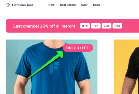
It’s a potent tool that amps up the scarcity factor and urgency, nudging sales upward. But it operates in a rather narrow niche. There’s hardly a horde out there Googling “how to add product badges on Shopify,” probably because they aren’t familiar with the term. At first glance, it seems like we’re limited to a tiny puddle of content that can drive conversions, making stakeholders hesitate to invest in creating elaborate, long-form content. They may reckon that content closely tied to our product won’t generate much traffic, while broader topics might attract a crowd but won’t lead to conversions.
So, what’s the game plan? Naturally, we start with our usual keyword research. But we take an extra step to segment our content into three tiers based on its purpose. Our tier-three content is often wide-ranging and awareness-focused, roping users into the journey. The second-tier content takes on an educational role, addressing user queries and offering valuable insights. It’s usually more closely linked to the product or service we offer. Lastly, tier-one content targets conversion, highlighting the value proposition and spurring the user into action.
Stepping back into the shoes of our product badge app developer, we’ve received kind permission to use our collaborative work with Burst Commerce as a case study (if you have a Shopify store by the way, seriously check them out). Drawing from this real-world example, we’ll examine a few scenarios to illustrate our approach more concretely.
| Tier | Content Title | Target Keyword | Keyword Volume | Explanation | Goal |
| 3 | The Ultimate Guide To Shopify Image Sizes | Shopify Image Sizes | 1900 | To move the user to a tier 2 or tier 1 piece of content | To move user to a tier 2 or tier 1 piece of content |
| 2 | How to increase conversion rates on Shopify | Shopify Conversion Rates | 880 | The volume for tier two content might not match that of tier three, but it hones in more closely on what our app does. Users at this stage are hunting for strategies to ramp up their conversion rates. Conveniently, our app does just that—it fuels conversion rates by fostering a sense of scarcity and urgency. | To move users directly to tier 1 content or to directly convert from here |
| 1 | How to add a Shopify label/product badge” | N/A | 0 | While this term doesn’t have much search volume, it fits perfectly as a contextual link from either a tier 3 or tier 2 piece of content. Imagine a scenario where we’re discussing strategies for enhancing conversion rates—that would be an ideal context to introduce this guide. | To convert and try our app |
There are a few things I want you to pay special attention to. Firstly, did you note how all 3 had a “linking topic”? In this example, the “linker” is “improving conversion rates”. It allows us to contextually link a tier 3 piece of content, all the way down to a tier 1 piece. Did you also notice how the main aim of the tier 3 content wasn’t to snag a conversion right away? And the tier 2 content, it had a couple of goals up its sleeves. The importance of this will become clearer soon.
So, once you’ve finished your keyword research and are organizing your content calendar, make sure to add another column in your spreadsheet to label the content tier. Keep in mind that not all niches need three tiers; for some clients, two tiers will do just fine.
Below is a screenshot of how our content calendar started to look.

The Importance of User Journey Mapping
User Journey Mapping is a methodological process where we map the potential footsteps of our users, from the moment they land on our site (and how they get to our site), to the ultimate conversion(s) path they take. There will be multiple types of conversions (both “macro” and “micro” conversions; something else we’ll touch on soon).
How To Create A User Journey Map
Let’s start with the final image of what we’re trying to achieve.
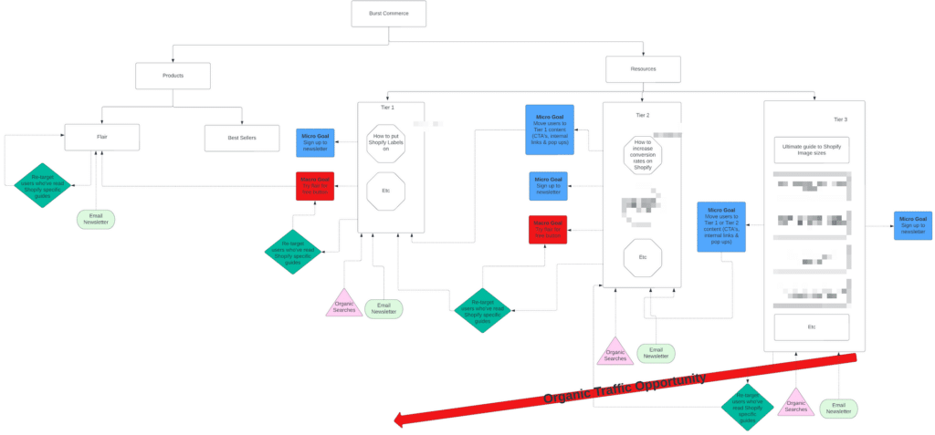
Depending on how you’re viewing this it may be hard to read everything so I’ll zoom in and explain the various sections below.
Firstly, up here is our homepage:

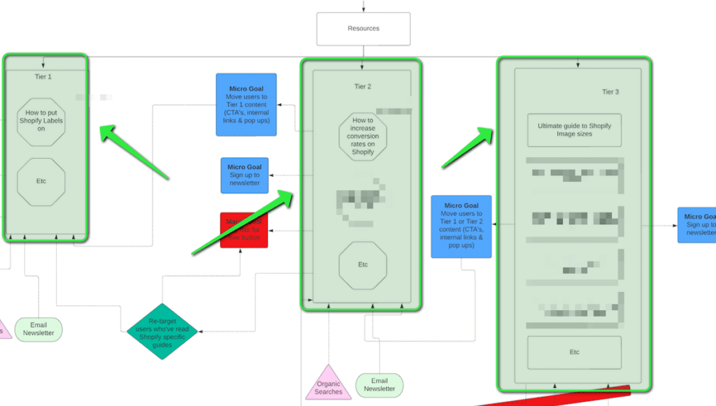
Then, we have our 3 tiers of content illustrated with some example content titles (blocked some out for client privacy):
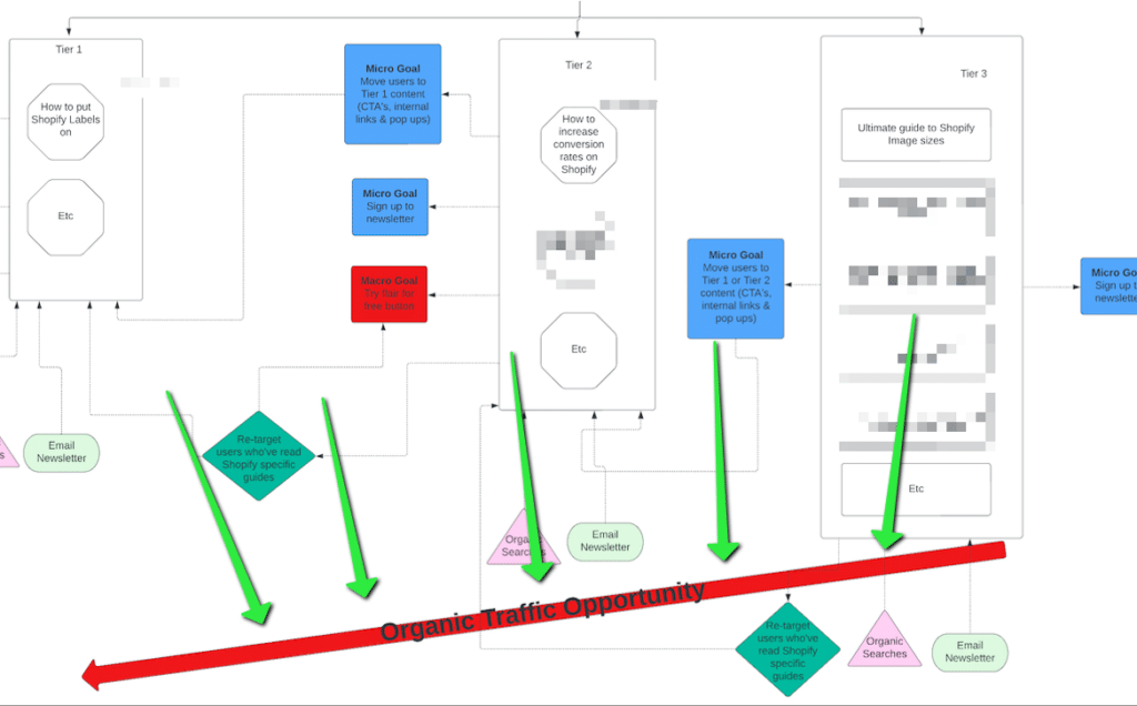
Notice this large, sloping red arrow indicating that there is less likely to be much traffic the nearer we go to “tier 1 content”:
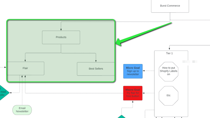
Over on the left, we have our product pages:
These various coloured shapes are the different “points” of entry to the site:
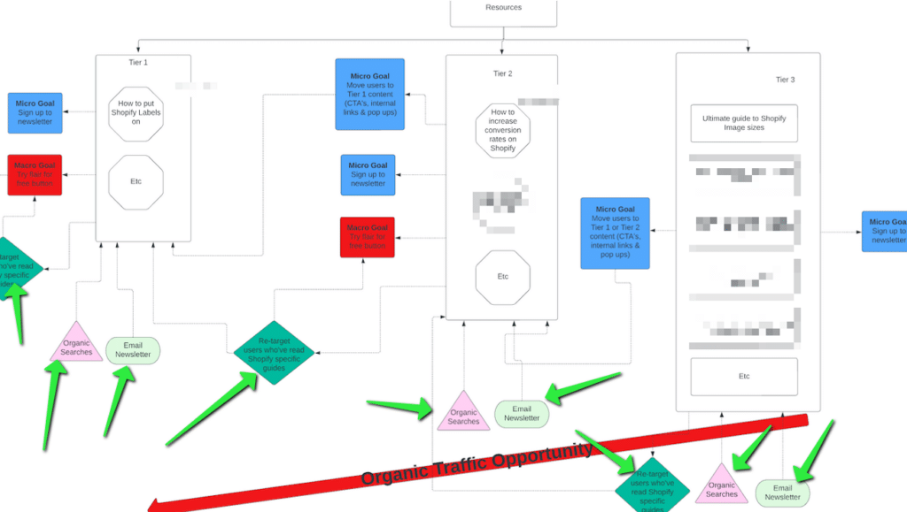
Some parts of the site will have more than one entry point. For instance, users might stumble upon blogs through organic searches or our email newsletter. On the other hand, some areas, like the homepage, will probably see mainly direct traffic. And let’s not forget about our retargeting strategies using paid ads and email marketing aimed at nudging users along the funnel. For example, a user reading a tier 3 article might sign up for our newsletter, and over time, we could steer them towards a tier 1 piece of content via an email or through social media retargeting. These are marked out too.
These red and blue squares are goals. The blue ones are micro goals (less important) and the red ones are macro goals (more important):
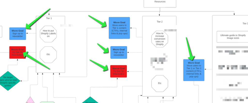
Notice how the overarching goal of tier 1 content is to prompt users to convert and try out the app. On the other hand, tier 2 content houses several smaller objectives. One aim is to shift users from a piece of “tier 2” content to one marked as “tier 1”. Another target is to get them to subscribe to the newsletter. There’s also a larger goal here of direct conversion, although it’s likely less probable than a user converting while on a tier 1 piece of content. Finally, tier 3 content has a couple of micro goals and no major ones. The focus of tier 3 content is purely to either get users to sign up for the newsletter or move them along to tier 2 content (although this isn’t completely visible in the zoomed-in screenshot above).
So, you’re wondering, “How do I create a user map?” Here are the steps:
- Get a Visualisation Program: Sign up for a visualisation tool like Lucid or Miro. You’ll be using this to create your user map.
- Determine Content Tiers: Next, figure out how many tiers of content you need. Create large, empty rectangles to represent these tiers and add them to your board. You’ll likely require two or three tiers, depending on your niche’s specificity. The middle tier functions as a medium search volume bridge, linking your very specific, low/zero volume tier 1 content and your broad, high-volume tier 3 content.
- Map Content Ideas: Now, map some title ideas from your content calendar into these tiers. This will help guide both you and your client.
- Map Product Pages: Map your “product” or “transactional” pages onto the board. This could be simple, like in our example which only has two Shopify app pages, or more complex if your website has numerous “transactional” and “lead gen” pages (in fact we’ve navigated through sites filled with various types of transactional pages before, including those with both lead gen and e-commerce setups. We can assure you it’s entirely manageable.)
- Map Entry Points: Identify the anticipated entry points to the various sections of your site. Determine how each pathway can—and will—lead to a “transactional” page. Your tier 3 content, for example, is likely to be discovered via organic searches, email newsletters, social media, or paid ads. However, tier 1 content (because of its lack of search volume) is primarily found by moving users from tier 2 or tier 3 content, or via newsletters or social/paid ads.
- Identify Micro Goals: These are smaller, important objectives that often don’t have a direct, attributable value but strongly indicate a user is moving towards a final conversion. They could include moving a user from tier 3 to tier 2 content (yes, this is trackable in analytics) or getting users to sign up for a newsletter. Depending on your business, “enquiry form filled in” or “contact us clicked” could be micro goals. Of course, they could also be macro goals—it all depends on what “conversion” means to you.
- Define Macro Goals: These are goals that typically have a more easily attributable value. Examples could be a “purchase,” an “enquiry form” submission, or a “contact us scheduled” event.
What do I do with this “User Journey Map”?
At this point, you should now have:
- Organised Content Calendar: This includes all your title ideas, any additional columns you usually incorporate, plus one extra for the “content tier”. You’ve tagged the content tiers in a logic that works best for you, keeping in mind that the further you move away from tier 1, the less directly relevant that piece of content is likely to be to your audience. It should, however, still be tangentially related at the very least.
- Mapped User Journey: Your user journey map now features key-tiered content ideas situated in their appropriate tiers. It also highlights the transactional pages where customers make their purchases and any other pages of relevance. In our example, there weren’t any, but for some clients, they also incorporate lead generation pages or other resources pivotal to advancing the customer journey. You’ve also charted out the possible paths website visitors might take to reach the various parts of your site (organic, paid, direct, newsletter, etc).
- Identified Goals: You’ve determined some micro and macro goals and incorporated these into all the key areas of your site.
The first thing you should do is send the user journey map to an analytics expert so they can set the micro and macro goals as events (and goals) within your analytics. I use tag manager, but here’s proof that I literally have them all set up (for another client who isn’t Burst Commerce):
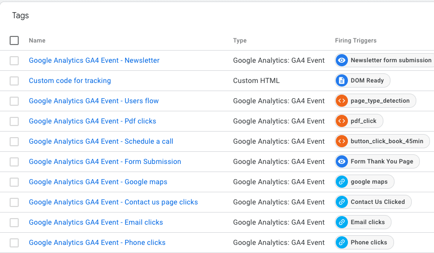
A lot of them will make sense just by looking at the names, but the “user flow” tag is the micro goal event that triggers when someone moves from tier 3 to tier 2 content (or tier 2 to tier 1 content).
Once this system is established and you’ve started collecting data, you’ll be able to assign value to various sections of your site; even those previously considered as only generating “vanity metrics.” This means you can explain the creation of certain content to key stakeholders beyond just saying, “it’s increasing our visibility.”
Here’s a step-by-step guide to understanding how this works:
Most businesses should be aware of their conversion rate when a user lands on their “primary conversion pages.” For instance, let’s imagine that Burst Commerce has 100 people a month landing on their “transactional pages” (the pages selling the app). Currently, they manage to convert 10% of these, resulting in 10 conversions per month. Before we’d set up any advanced tracking and user journey mapping, it was challenging to understand where these 100 people originated. They likely came from direct traffic, the Shopify store, social media shares, or maybe a guide we wrote. However, without advanced tracking, it was impossible to know this for sure or experiment with different ways to enhance the chances of visitors moving to our product page.
With the introduction of a “tiered system” of content, we ensure not to rush the sale of our product, which could result in losing a potential conversion. Instead, the aim is to gradually guide them through the content tiers. In this example, let’s assume 50% of users read a tier 1 piece of content and then view our product page (where a final 10% convert remember).
By mapping the user journey and identifying micro and macro goals, we can pinpoint areas and feedback loops where we can increase the chances of keeping a user engaged with our system. Let’s say we get 1,000 organic visitors per month landing on a tier 3 piece of content. The ultimate goal is to convert them. One strategy is to get them onto our email subscription list and send them emails directing them to our tier 2 and tier 1 content. If they sign up for our newsletter (a micro goal), and we know that about 25% click on the links we share, then we can estimate that 25% of these subscribers will end up reading tier 1 content, 50% of these will then land on a product page and finally 10% of these will convert. So, in this case, the tier 3 content can be said to be worth 3.75 conversions/month (1,000 people * 25% newsletter click-through rate * 50% tier 1 to product page user flow * 3% conversion rate).
Visitors may also follow a different path: they might land on a tier 3 article and then navigate to a tier 2 article mentioned within it (this is another element I track in the “user flow”). My tracking data could reveal that about 10% of those who visit my tier 3 content click through to the tier 2 content. Moreover, I might find out that an additional 10% of those users click from tier 2 to tier 1 content. We know from here that 50% then go on to visit a product page with 3% of those ultimately converting. So, in a scenario where 1,000 people land on a particular tier 3 piece of content, 10% might progress to tier 2 (that’s 100 people), and then 10% of those move on to tier 1 (which leaves us with 10 people). 50% of them view a product page (5 people) and finally, 3% convert (about 0.15 people/month).
You may have to read the example a few times, but hopefully, you can see that this process allows me to calculate a tangible value for that tier 3 page, providing a solid reason for its existence. More importantly, this understanding lets me experiment with different strategies to increase the chances of a visitor “clicking-through” to different tiers (like changing the link colour, altering anchor text, or using pop-ups).
Keep in mind, there are other possible routes and conversion percentages I haven’t explored in this example (like social retargeting, etc).
As a bonus, you can even create a tag that extracts the tier level of a piece of content from the data layer. This enables you to compile a comprehensive, rolled-up report for clients stating something like “In the aggregate, our tier 3 content has accomplished these micro and macro goals, resulting in an estimated total value of this amount”.
Conclusion
You might find yourself in one or more of the following situations:
- You’re constantly being asked about the value of certain content pieces you’ve created, and you struggle to justify their worth beyond simply stating “it drives significant traffic”.
- As a niche site, there’s limited direct content related to your field that you can produce. While you recognize there’s potential for creating content that’s indirectly related to your work, you question if it’s a valuable investment since it might not lead directly to conversions.
- You want to maximize the benefits of your existing content, understand its role in your site’s ecosystem, and find a measurable method to test and improve how it steers users towards conversions.
The solution to these issues lies in categorizing your content into tiers and mapping the user journey across them.
Categorizing your content helps to ensure that you’re not prematurely pushing a product to your users. It enables you to define the goals of a specific content piece clearly. For instance, tier 3 content isn’t meant to convert directly, but it’s designed to guide users elsewhere. The key performance indicator (KPI) for such content would then be the percentage of users it redirects to another area of the site.
Mapping the user journey helps you think about the micro and macro goals, identify potential feedback loops, pinpoint any gaps in the user journey, and understand the diverse goals and KPIs your content may achieve, other than just driving traffic or conversions. This approach encourages you to consider how the entire site operates in unison.
Once you’ve implemented these strategies and set up proper tracking, you’ll gain a clearer understanding of the function and value of your content. You’ll also identify areas where you can optimize your marketing strategies to ensure everything drives users towards eventual conversions.
Now the question you should have whilst reading this is “Where am I in Andy’s tiered journey for Keyword Insights”. Well, this is very much a tier 3 piece, but I’ll try and force it to be a tier 1 now in 3…2…1:
Hey. Subscribe to Keyword Insights, an incredibly powerful content marketing platform. You won’t regret it ;).
Start your trial today for only $1
Sign up today for a $1 trial and enjoy access to 6000 keyword clustering credits, 3 Keyword discovery searches, 1 Content Brief and Pro versions of SERP Similarity, SERP Explorer.
Subscribe to our newsletter
Subscribe to get our latest news, offers, insights, and any updates.

